Nong Studio:ORO Tiramisuteca 甜品店设计
One step in the past, and one step in the future
一步过去,一步未来
——ORO Tiramisuteca 上海陕西南路店设计
.jpg")
“在我们选址的时候,我们首先考虑有历史感的街区,然后想的是在历史街区里成为时尚聚焦地。一步踩在过去,一步踏向未来”,这是来自意大利品牌创始人的诉求。
“ We prefer stores to be located in historical locations. But we also want to be modern destination. One step in the past and one in the future”. It is required by the Brand founder.
.jpg")
对于这样一个以意大利传统甜品——提拉米苏为单品的品牌概念店,他们既以相传几代的传统配方为傲,又以互联网经济的快速物流为依托,创造了可以远距离配送但无添加的产品。基于这种矛盾气质,我们也以复古与摩登的冲突为出发点去试着去诠释传统商品的消费升级,让传统品牌得以重生。
The Italy-oriented brand devotes itself to heritage tiramisu recipe of generations, using natural ingredients without any artificial additives. But on the other hand, the business model is extremely modern, futuristic even-it’s an online-based pasticceria brand that are designed to be suitable for long-distance delivery meanwhile kept the taste quality. It is required to be represented “balance” in the store design.
.jpg")
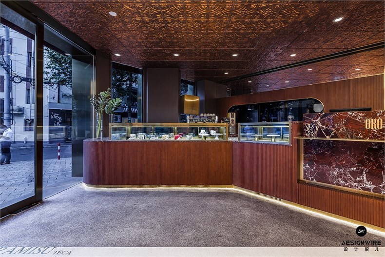
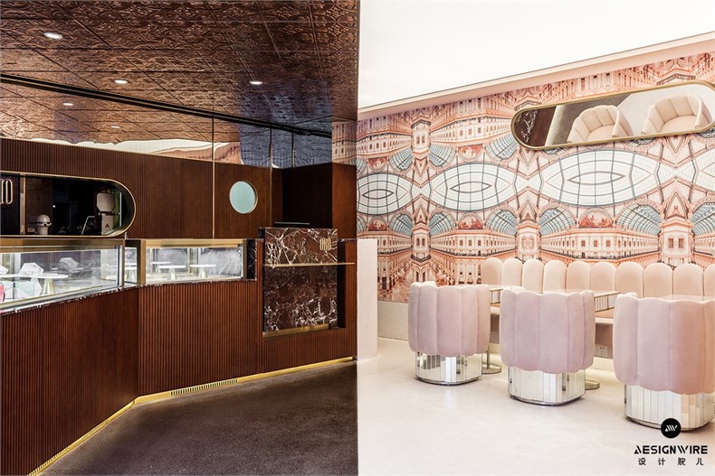
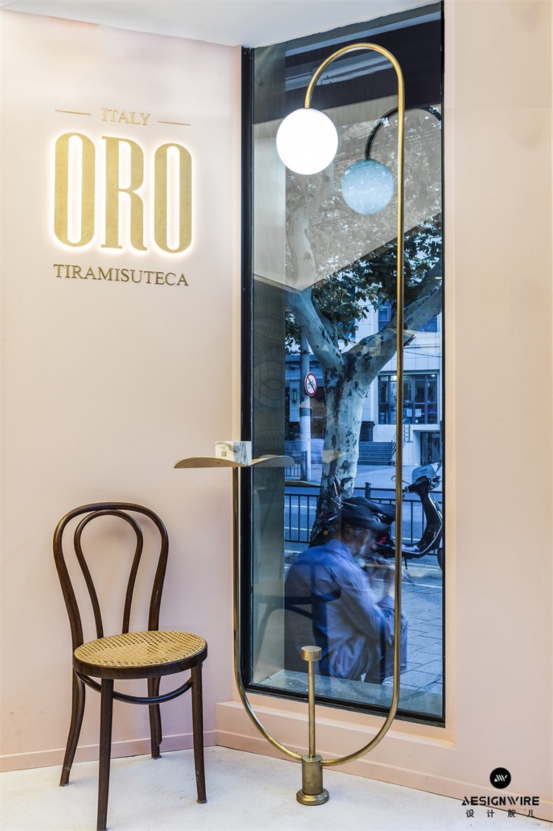
这个源自于意大利的品牌的店铺坐落于上海法租界,店铺的设计是一场空间与时间维度上的蒙太奇——链接着传统与摩登,过去与现实,历史文化与商业喧嚣——一条清晰的分割线沿对角线将店铺分成两块。一面带你步入20世纪中后叶的米兰,棕色胡桃木饰面,深褐色水磨石地面,黄铜,雕花吊顶,仿佛一场穿越回到后现代的米兰。而另外一边,与之相对应的是画着米兰著名的让努维尔二世拱廊的粉色墙纸,丝绒的粉色软包,粉色的水磨石地面,镜面和发光灯膜吊顶。所有材料和质感上的对比都隐喻着复古与摩登的品牌内涵。
The first concept store in Shanghai is located in one of the previous French concessions. The store itself is an architectural montage- a space that embodies the bridges between the authentic and modern, past and present, historical eras and cultures- literally divided into two. One side, straight stepping out from 20th -century Milan, richly ornamented woodwork, floored by dark brown terrazzo, concealed by the paneling, a montage harks back to subtle feeling of Milan post-modernism. The opposite side, designed in a modern appearance, is paved with pink terrazzo, pink bespoke wallpaper and illuminated ceiling highlighting brand’s idea.

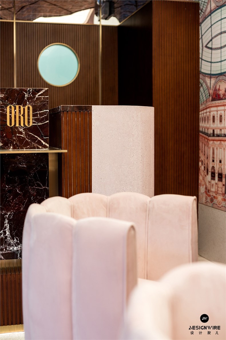
水磨石这种做法源自于15世纪的意大利,颜色上的区分不是一种简单的分割,而是在同一种基底里加上了不同的矿物质。同样的灵感运用到墙上,条纹胡桃木在20世纪被广泛用在米兰的公共空间的装饰上,有一种时代烙印;而另一个米兰标志——让努维尔二世拱廊,我们又将其平面处理成镜像图案,制作成粉色墙纸,当两种材质在墙角上相遇,是不同时期米兰的对话,也讲述着这个品牌的内核——既尊重传统,又不拒绝时尚。
The store represents the meeting of two worlds, connected by a sharp division line of two different color terrazzo, reminiscent of the art of terrazzo. Innovated in fifteen century’s Italy, different colors in terrazzo are made from different minerals added into the same base material. The same inspiration on the wall, the pattern of pink bespoke wallpaper illustrates the other Milan icon----Galleria Vittorio Emanuele II,when dark walnut wood meets the pink bespoke wallpaper , the true nature of the brand is made that clear: both temporally and spatially- which, gifted by generation heritage, does not shy away from any creation or combination.
意大利的传统经典被我们所熟知,意大利的现代工业设计也被我们所膜拜,而有意思的是,后者起源于二战以后,也正是意大利最具代表的甜品——提拉米苏的诞生时期。
The main goal of the project was to create a space that presents a perfect balance between contemporary and modern Italian cultures, which almost since when tiramisu was born after World War II.

惊喜于这种巧合,我们设计了以提拉米苏原材料手指饼干为原型的粉色丝绒沙发和粉玉咖啡桌来致敬意大利后现代设计。与空间另一边的胡桃木和紫罗红大理石遥相呼应,让人在一进入这个店铺的时候,就有一种时空上的穿越感。
The result emerges an assemble of pink-velvet furnished sofas which take the shape from ladyfingers used in tiramisu recipes representing Italian modern design, combined with traditional Italian soul of the brand emphasized by walnut cabinets and marble counter. It gives anyone who enters the instant understanding of what I set out to achieve. It is very obvious the first moment you walk in.
宁可丰盛过度,也不要简单贫乏,是我们对以索德萨斯为代表的米兰后现代设计的研究心得。我们也以这样一个蒙太奇的设计灵感向孟菲斯设计致敬。设计的功能并不是绝对的,而是具有可塑性的。功能不仅是物质上的,也是精神上的、文化上的。产品不仅要有使用价值,更要表达一种精神层面上的内涵。戏谑、玩笑、是一种生活态度,一种宽松和舒展的心态。
The idea was based on many research and archives that our team have collected when traveling around the world. We have always admired and wanted to work with traditional Italian unique craftsmanship. While on the other hand, Milan-based post-modernism masters like Ettore Sottsass elegantly radical style was one of our biggest fascinations. While paying attention to his tribute and focus in design, we decide to commit ourselves into our own creation.
建筑公司 :NONG STUDIO
完工时间 :2018.07
建筑面积 :80 sqm
项目地址 :上海市陕西南路35号
主创建筑师 : 汪昶行 , 朱勤跃
设计团队 :王坤阳 , Luca Lanotte(意)
摄影师 :汪昶行
灯光设计 :杨飞
客户 :ORO Tiramisu Italy
施工团队 : 上海桃义建筑装饰工程有限公司
主要材料 :胡桃木,黄铜,镜子马赛克,不锈钢,紫罗红大理石,粉红玉,定制软包,定制壁纸,张拉灯光膜,铝板压花顶面等
Design Studio: NONG STUDIO
Completion year: 2018.07
Area : 80 sqm
Address: No 35, West Shanxi Rd, Shanghai
Chef designer:Chasing Wang、Neal Zhu
Design Team: Luca Lanotte(Italy)、Kung Yang
Photographer:Chasing Wang
Lighting Consultant:Fager Yang
Client:ORO Tiramisu Italy
Construction Team:Shanghai Taoyi Construction & Decoration Engineering Co.,Ltd
Main materials:Walnut wood, Brass, Mirror Mosaic, Stainless steel, Rosa Levanto Marble, Pink Onyx, Bespoke fabric, Bespoke wallpaper, illuminated membrane ceiling
Edit by Designwire
-

Nong Studio:ORO Tiramisut...
-
NONG STUDIO:OIAM 时尚买手...
-

NONG STUDIO:NONG STUDIO工...
-

汪昶行:MY DREAM WEDDING高...